Ribbon
The main content authoring tools are located on the ribbon of the Canvas Envision Creator.

The ribbon is always visible and includes the following:
The ribbon tabs that represent subsets of the Creator's functionality by categories. There are the default and contextual tabs. The default tabs are always visible. The contextual tabs appear on the right after the default ones when you select specific objects in the document.
The ribbon tab contents that are the tools of the given tab category in panels.
The document status indicator that displays the current document status and version. The indicator background color depends on the status.
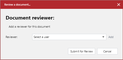
The Review button to submit the latest version of the document for review using the Review a document pop-up dialog.
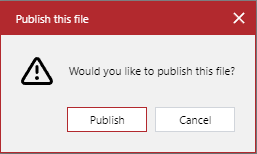
The Publish button to publish the latest version of the document using the Publish this file pop-up dialog.
The Help button to open the Canvas Envision Knowledge Base on another browser tab.
Default ribbon tabs
By default, the ribbon always displays the following tabs:
File: to go to the Home screen of the Canvas Envision Creator.
Home: to quickly access the most frequently used tools from various categories.

Insert: to insert objects, such as images, vector drawings, 3D models, animations, and so on.

Draw: to navigate, resize, position, align, transform objects, and draw shapes.

Action: to manage page and layer actions.

Layout: to manage pages, layers, grid, guides, snaps, smart mouse, and text merge.

View: to manage the visibility of the UI elements on the main screen and objects in the main working area and to preview the document in the Canvas Envision Web Viewer.

Help: to go to the list of shortcuts, knowledge base, and technical support page and to verify the document against errors.

Short video tutorial
Contextual ribbon tabs
In addition to the default tabs, the ribbon features the contextual tabs for working with specific kinds of objects. By default, these tabs are hidden. When you select such an object in the page layout area or pasteboard, the ribbon displays the contextual tab for this object after the default tabs on the right. For example, clicking a 3D model object displays the 3D Model tab with the tools for working with 3D models. Subsequent clicking outside the 3D model object hides this tab from the ribbon.
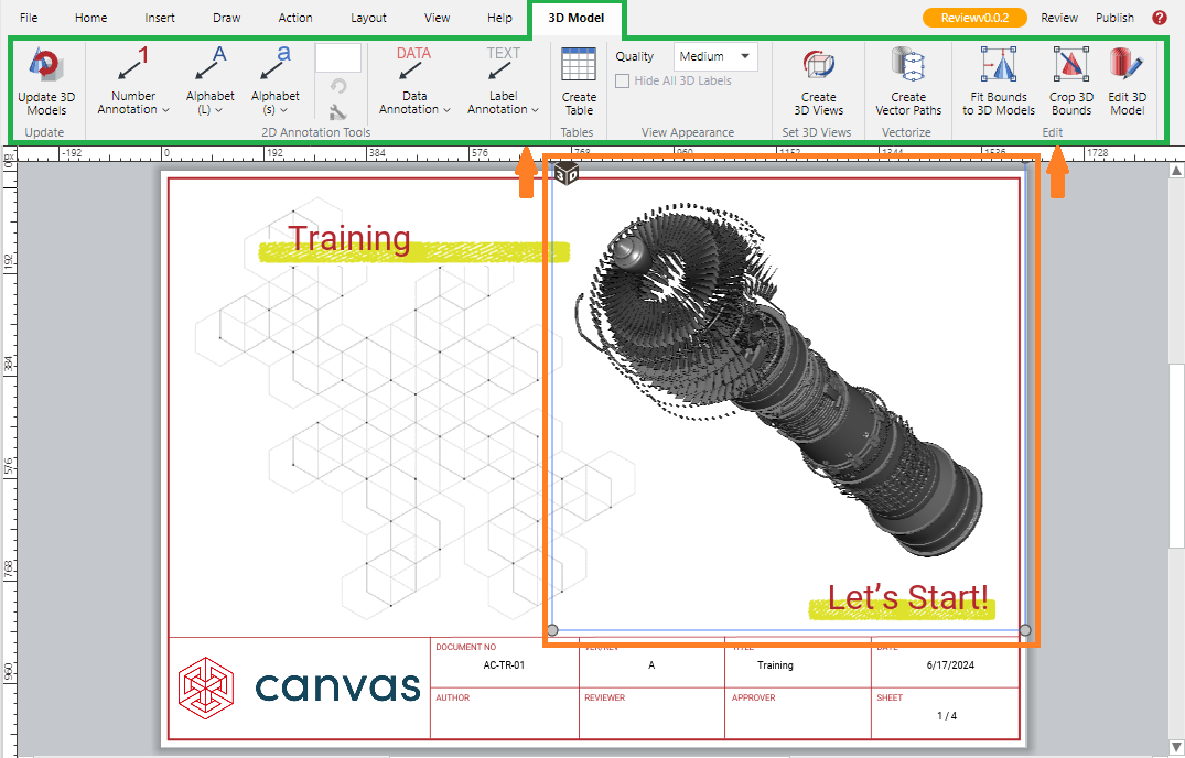
The contextual ribbon tabs are the following:
Text

Table

3D Model

Animation

Image

Lens

Dimensions

Smart Line

Multigon

QR Code

Ribbon tab contents
The contents of each ribbon tab are the tools and settings pertinent to the tab category. Some tools and settings can be present on multiple tabs. For example, the Home tab hosts tools that also exist on their specific tabs.
Each tool and setting on a ribbon tab is represented by a specific UI element. For details on the types of such elements, see Envision Creator UI Elements.
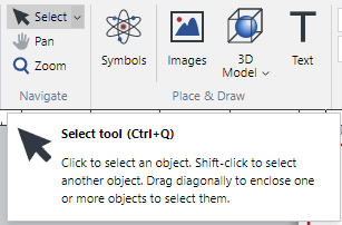
Hovering over a tool or setting on a tab displays a tooltip below the ribbon with a short tool or setting description.
Ribbon panels
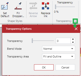
The tools on the tab are grouped into panels separated by vertical lines. A panel is a rectangular region on a tab that contains a set of related controls and options. For example, the Draw tab includes the Navigate, Draw Tools, Shape Styles, Transparency, and other panels.

Some panels, like Transparency, have a dialog launcher button in the bottom right corner to show a pop-up dialog with more advanced features and options, such as Transparency Options in our example.
On narrow screens, panels collapse into menus.
