Envision Creator UI Elements
You work with the Canvas Envision Creator using the elements of its graphical user interface (UI) that represent tools, actions, states, modes, settings, etc. Such UI elements are located on bars, ribbon tabs, panes, and pop-up dialogs. Some elements can be present in multiple places.
The table below describes the types of UI elements the Canvas Envision Creator includes.
Image example | Type | Description |
|---|---|---|
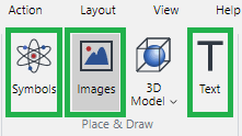 | Button | A rectangular UI element that initiates an action, tool, state, or event when you click it. Some buttons can be selected or deselected. The background of selected buttons is highlighted with dark grey. |
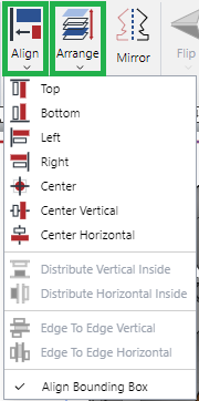 | Menu | A drop-down list of actions and tools. You should click the menu to disclose it and then click an action or tool from it; for example, click Align > Top. Menus look like buttons but have the down chevron. |
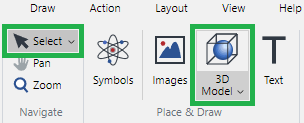 | Split button | A combination of a button and a menu. You can click the button part to trigger the default action or select an alternative action from the menu part. Split buttons look like menus, but hovering over them highlights only the button or menu part, not the whole split button. |
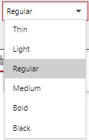 | Drop-down list | A drop-down list of predefined mutually exclusive options of a given property or setting, from which you should select one to configure this property or setting. |
 | Text field | A field where you should type an arbitrary text or number. |
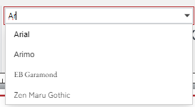 | Combo box | A combination of a drop-down list and a text field. You can select an option from the list or type it in the field. The system ignores the typed values that do not exist on the list. |
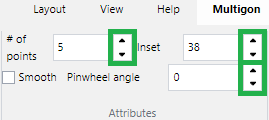 | Up and down spin buttons | Up and down arrow buttons in numeric text fields that you should click to increase or decrease a given number by the default increment, which is usually 1. Alternatively, you can type numbers in such fields. |
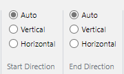 | Radio button | A round button in a group of similar buttons that represent mutually exclusive options of a given property or setting. You can select only one radio button in the group to configure this property or setting. |
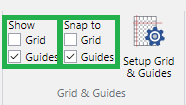 | Checkbox | A square box in a group of similar boxes that represent non-exclusive options of one or more properties or settings. You can select none, one, or more than one checkbox in the group to configure these properties or settings. |
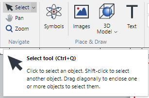
Hovering over some UI elements displays a tooltip with a short element description.
