Status Bar
At the very bottom of the main screen of the Canvas Envision Creator, there is the Status bar.

The Status bar consists of the following two sections:
On the left: the status controls that are either:
The page status controls for the currently shown page if no object is selected.
The object status controls for the currently selected objects if one or more objects are selected.
On the right: the zoom and navigation controls.
By default, the Status bar is visible. If necessary, you can hide or show it.
Page status controls

When no object is selected, the left side of the Status bar includes the following indicators for the page currently shown in the page layout area:
Page Number: the number of the current page out of the total page number. Clicking it shows or hides the Page Navigator pane.
Page Size: the width, height, and aspect ratio of the current page in the unit of measure set for the page.
Scale: the scale ratio of the current page in the unit of measure set for the page. It is similar to the scale of a map: a distance on the page layout area to the corresponding distance in the real world. For example, 1:1 (px) means that 1 pixel on the page is equal to 1 real pixel. Objects on the page have the same scale.
Master Page: the master page given for the current page.
Layer: the currently selected layer.
Object status controls
The left side of the Status bar displays different object status controls depending on whether one or multiple objects or groups of objects are selected in the page layout area and pasteboard of the currently selected page.
Status controls for one selected object or group

When one object or group of objects is selected, the left side of the Status bar displays the following controls for this object or object group:
Page Number: the number of the current page out of the total page number.
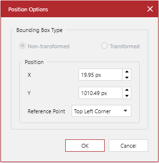
(X,Y)=: the X and Y coordinates of the position of the bounding box of the selected object or group on the page in the unit of measure set for the page. By default, the position is from the top left corner of the page layout area to the top left corner of the bounding box. Clicking this control displays the Position Options pop-up dialog, where you can change the position coordinates and the reference point.
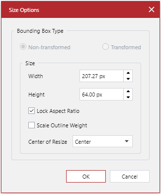
W: H:: the width and height of the bounding box of the selected object or group in the unit of measure set for the page. Clicking this control displays the Size Options pop-up dialog, where you can change the position coordinates and the reference point.
Object Type: the type of the selected object. For some objects, it displays data as follows:
Image: the color scheme, resolution, and size of the selected image.

Group of objects: the quantity of the objects in the group.

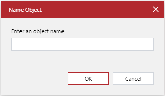
#: the name of the selected object or group. By default, it is a number. Clicking this control displays the Name Object pop-up dialog, where you can rename the object.
Layer: the currently selected layer.
Status controls for multiple selected objects or groups

When multiple ungrouped objects or groups of objects are selected, the left side of the Status bar displays the following controls for these objects, object groups, and the current page:
Page Number: the number of the current page out of the total page number.
(X,Y)=: the X and Y coordinates of the position of the bounding box of the object or group first selected on the page in the unit of measure set for the page.
Scale: the scale ratio of the current page in the unit of measure set for the page.
Master Page: the master page given for the current page.
Objects: the quantity of the selected objects.
Layer: the currently selected layer.
Zoom and navigation controls

The right side of the Status bar always displays the following zoom and navigation controls.
The Zoom Slider: to zoom in or out of the page by dragging the slider thumb or clicking the - and + buttons.
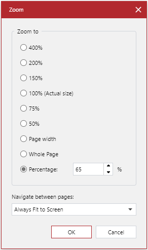
The Open Zoom Dialog Box button: to display the Zoom pop-up dialog, where you can specify the zoom level in percentages and the default zoom level.
The Zoom to 100% button: to zoom the page to 100%.
The Fit to Window button: to restore the fit-to-window zoom and screen position of the page layout area.
The Zoom tool button: to turn on the Zoom tool.
The Pan tool button: to turn on the Pan tool.
The Select tool button: to turn on the Select tool.
Hiding and showing the Status bar
By default, the Status bar is visible. If necessary, you can hide or show it using the Panes panel on the View ribbon tab.
To show or hide the Status bar:
Go to the View ribbon tab.

In the Panes tab panel:
Select the Status Bar checkbox to show the Status bar.
Clear the Status Bar checkbox to hide the Status bar.
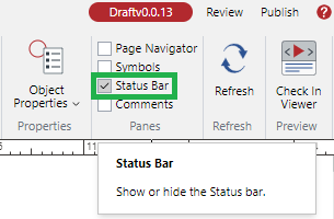
The Status bar appears and disappears against your actions.